代码:
<html>
<body>
<div>
<div style="display: inline-block; background: #111; width: 200px; height: 200px;"></div>
</div>
</body>
</html>
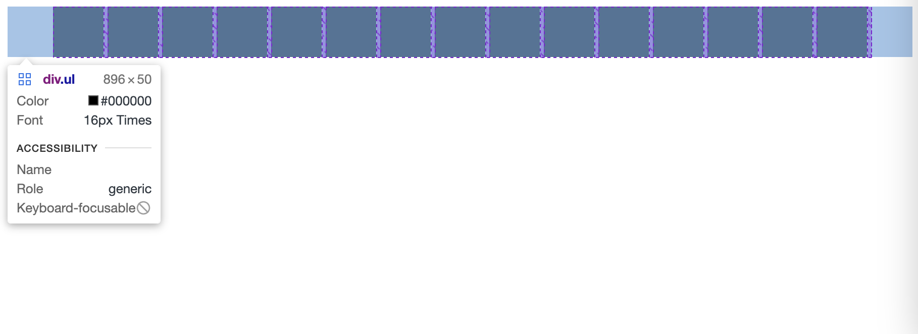
预期效果是 div 列表居中,但列表内容不居中(像例图中的效果,最后一行在左边)
如果直接 text-align: center ,最后一行也会被居中 如果再套一层 div 再 text-align: center ,因为一行显示不下的情况下内层 div 宽度是 100%,所以外层的 center 根本没生效,尝试了一堆 flex width:fit-content 之类的样式全都不能 trim 内层 div
![]() |
1
codehz 10 天前
一眼 display: grid
|
![]() |
2
horseInBlack 10 天前
给 list 加一个 margin:0 auto;就行了
现代 CSS 不会整就直接 flex 就行了,flex 该怎么对齐就怎么对齐,你这种情况往外面套容器 div ,容器里面继续 flex 也能重新设置对齐方式 <html> <body> <div class="list"> <div class="box"></div> <div class="box"></div> <div class="box"></div> <div class="box"></div> <div class="box"></div> <div class="box"></div> <div class="box"></div> <div class="box"></div> <div class="box"></div> <div class="box"></div> </div> </body> </html> <style lang=""> body { background-color: skyblue; } .list { width: 500px; margin: 0 auto; } .box { display: inline-block; background: #111; width: 100px; height: 100px; } </style> |
![]() |
3
Posuker 10 天前
有点懵,简单写一下。
<html> .... <body> <div style="margin: auto; display: flex; flex-wrap: wrap; width: 1200px"> <div style="width: 200px; height:200px"></div> <div style="width: 200px; height:200px"></div> <div style="width: 200px; height:200px"></div> </div> </body> </html> 这样出来的效果,大概符合预期 |
4
edis0n0 OP @horseInBlack @Posuker 但我这情况 list 是不固定宽度,填满自动换行的,你们的方案都要固定列表宽度
|
6
edis0n0 OP @horseInBlack #2 试过 div ,填满自动换行还是会导致宽度变成 100%而不是实际宽度,无法居中
|
7
edis0n0 OP @horseInBlack #6 试过 div 》 试过 flex
|
8
wenzhoou 10 天前
https://jsfiddle.net/a2pz3d6r/
<div class="outer"> <div class="inner"> </div> <div class="inner"> </div> <div class="inner"> </div> <div class="inner"> </div> <div class="inner"> </div> <div class="inner"> </div> <div class="inner"> </div> <div class="inner"> </div> <div class="inner"> </div> <div class="inner"> </div> <div class="inner"> </div> </div> .outer { display: flex; flex-wrap: wrap; flex-direction: row; justify-content: center; } .inner { display: inline-block; background: #111; width: 200px; height: 100px; margin: 10px; } |
![]() |
9
buxudashi 10 天前
你都固定宽度了。不能 float:left 吗?
|
11
wenzhoou 10 天前
没看清题
|
![]() |
12
codehz 10 天前
@edis0n0 只要一层就可以了
grid 设置好列的模式 最后用 justify-content https://developer.mozilla.org/en-US/docs/Web/CSS/justify-content |
![]() |
13
codehz 10 天前
设置列的模式,就用 grid-template-columns: repeat(auto-fit, 100px);
100 可以换成需要的宽度 甚至还能配合 minmax 做列的宽度自适应 中间的 gap 就直接用 gap 属性 |
14
wenzhoou 10 天前 ![]() 是不是只能动用 js 大法了? https://jsfiddle.net/Ln9r67st/
你可以试试。 |
16
crystom 10 天前
设置外层的宽度
|
![]() |
17
otakustay 10 天前
https://codesandbox.io/s/responsive-grid-5q3s2
类似这个么?只要把外面的容器用 flex 居下中就行? |
![]() |
18
qwq11 10 天前
#2 就是最简单的,不过好像 margin 写反了?
<html> <head> <style> #container { margin: auto 5rem; } #container > div { background: #111; width: 200px; height: 200px; display: inline-block; } </style> </head> <body> <div id="container"> <div></div> <div></div> <div style="width: 600px"></div> <div></div> <div></div> <div style="width: 800px;"></div> <div></div> <div></div> <div></div> <div></div> <div></div> <div></div> </div> </body> </html> |
19
edis0n0 OP |
20
CYTMWIA 9 天前 ![]() []( https://imgse.com/i/pStuT2Q)
可以试试`flex-wrap`参数 https://developer.mozilla.org/zh-CN/docs/Web/CSS/flex-wrap 可以做到堆叠元素(放不下就换行),但对于 方块集合 会在右边缘有空白 添加`justify-content: center;`到列表容器可以让方块堆叠后居中(但最后一行也居中了) |
![]() |
21
zhengjian 9 天前 ![]() |
22
c0t 9 天前 via iPhone
感叹你的活好杂,上次还在问 shader 呢…
|